Next story: Impulses and Obstacles: Select Prints by Kathleen Sherin at Pausa Art House
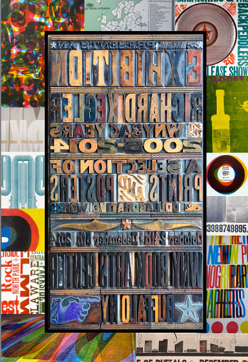
A Collection of Rich Kegler's work at WNYBAC
by Jack Foran

By the book
To the list of icon emblems of Buffalo and Western New York—the grain elevators, Frank Lloyd Wright’s Darwin Martin House, City Hall—Rich Kegler would add another—the book. And more than just the book, the technology of the book, of movable type letterpress printing, the way it was done traditionally, from the Gutenberg era to the present era. But pretty much stopping there.
The analog method, where the words and images you see on the page were printed there by means of physical analogous source objects. Very low-relief sculptural objects, actually. Versus digital virtual methods, via computer and associated technology. The way book and most other printing is done these days.
But analog is so much cooler. Just because tangible, palpable. And so, scrutable to the pre-cyber-wired human intelligence, the condition most of us are still mired in, flailing around, trying to understand the world around us with maybe no less complex and sophisticated but certainly less strictly disciplined, more easily fatigued, apparatus than the world now routinely brings to bear on intellectual and production tasks alike.
Moreover, with tangible, palpable things, you can make other things—by hand, not just by mind and machine. The tradition, by and large, of the arts, and artists. We’re still mired in that tradition, by and large. Maybe in a transition state. All this might change in the future—surely is changing—but not yet. And who knows changing how much, ultimately.
Availing himself of the print shop wonderland toybox of letterpress type and decorative elements, in myriads of fonts and styles, housed in cabinets and trays in the basement of the Western New York Book Arts Center, Kegler has created artwork depictions of the more usual suspect area icons, casually turning them into book arts objects, and sometimes actual books. His version of a grain elevator complex, when you look closely, the individual silos are books on a shelf, turned backwards, spine in, so what you’re looking at are page ends and book cover ends, the juxtaposition lines between silos. The silo roofs are large-font parentheses, turned facing downwards. All elements in the depiction are from the toybox.
His version of the Darwin Martin House is composed of semi-solid-tone blocks and lines and small-item decorative elements, and large-font parentheses again, this time cup upwards, representing the large crater planters, the architect’s sole contrastive features to the severe horizontal linear character of the building. In his version of Kleinhans Music Hall, the large exterior wall segments—above the reflecting pool—were printed from end-grain wood blocks, cut with a rotary saw or sanded with a rotary sander, it looks like. Faintly revealing the tree annual rings pattern, beneath an equally faint saw or sander rotary pattern, the two slightly out of phase. Swirls and spirals. A vaguely sea shell effect. Very beautiful.
Also on display are a hundred or so of Kegler’s posters and publicity materials, announcing and advertising events and venues from Big Night to Starlight, Nick Lowe to Bobo, an analog artists’ showcase to the WNYBAC holiday marketplace.
Among the posters is one called “Analog Forever” (a collaborative effort with fellow WNYBAC artist Chris Fritton). The main feature is an exact image of an LP vinyl record—analog technology, of course—printed directly from the LP. The print source inky actual LP is displayed above the poster.
In addition, attesting to the Western New York area’s significant role in the history of letterpress printing, a small printed sheet with text and a stylized representation of Niagara Falls—the cascade—tells of a gathering in the city of Niagara Falls in 1886 of the Type Founders of the United States—a trade group of artisans who made metal type for the printing industry—which there adopted a key standard for the production of letterpress materials called “type height,” that is, the prescribed height of each individual type block, including the sculptural character to be printed—the glyph—and metal or wood or whatever backing or base. This had to be the same for each type item to assure that the character would print. For whatever reason, the agreed-on type height was 0.918 inches. It is still the standard, and still key.
Kegler is the founder and artistic director emeritus of WNYBAC. The exhibit comprises work he did at and in association with WNYBAC from 2005 to 2014. It continues through December 5.
blog comments powered by Disqus|
Issue Navigation> Issue Index > v13n47 (Week of Thursday, November 20) > Art Scene > A Collection of Rich Kegler's work at WNYBAC This Week's Issue • Artvoice Daily • Artvoice TV • Events Calendar • Classifieds |


 Current Issue